/ work

Radial Mind Maps

Company

Venngage

Role

Product Designer
Product Manager

When

May 2021 - October 2021
A grayscale image of a radial mind map with one central node and 12 child nodes

Designing a widget to help users create radial mind maps effortlessly

In early 2021 I was part of a team of designers and developers dubbed the “Smart Platform” to design and build “smart” widgets that can be used in varying layouts. By April 2021, my team within the Smart Platform—myself and 2 developers—shipped a simple yet powerful mind map widget. While this was an order of magnitude improvement on the free form shapes, it wasn’t enough. Our most popular mind map templates were radial mind maps—something that this new widget couldn’t do. This, coupled with the diagramming competitive landscape, we knew we had the opportunity to build something infintely more useful and completely novel.

What are users creating?

Venngage users overwhelmingly start their designs with a template. Our usage data helped us see that our top 3 mind map templates were all radial mind maps. ~45% of unique design completions started from a radial mind map template.
A bar chart of Completion rates of mind map templates
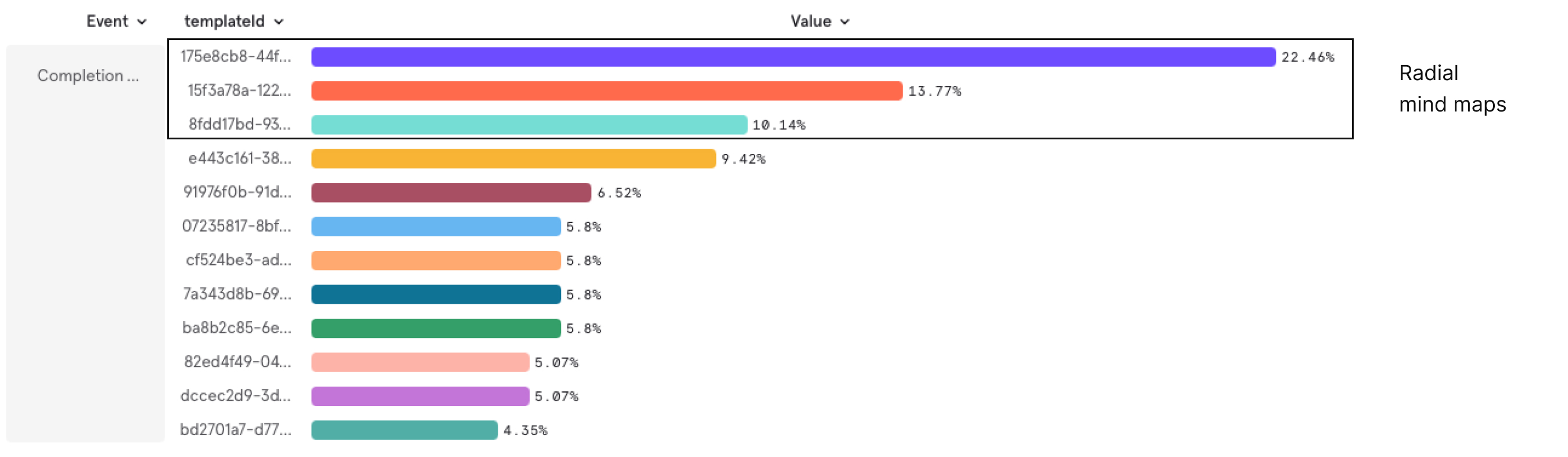
Mixpanel data showing Completion rates of mind map templates.
Although, these templates were completely free-form—meaning that users can take any element and do as they like with it, they largely stuck with the template layout. We saw this repeatedly with user designs. They wanted to maintain the radial look and feel.
Examples of user designs of free-from radial min maps
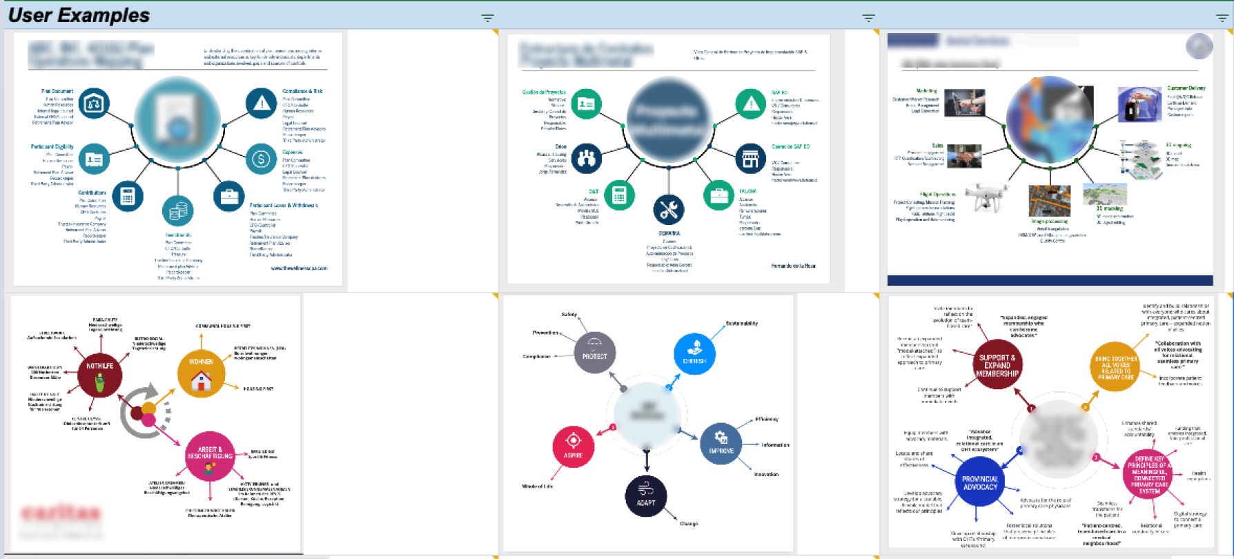
Example of user creations. Some parts are intentionally blurred to maintain confidentiality.
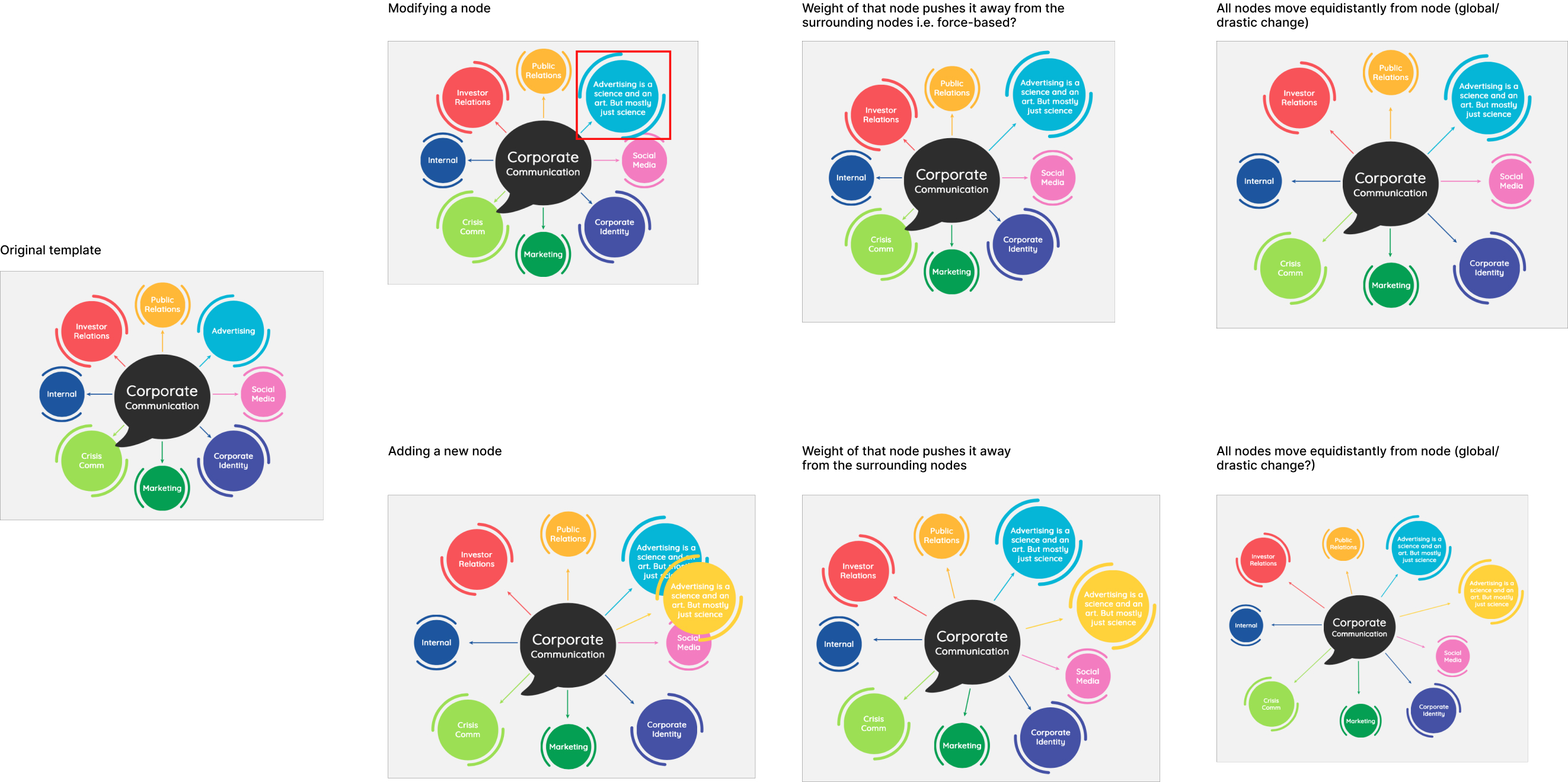
Prior research showed us that adding, modifying, or editing nodes in a mind map was an arduous task. Radial mind maps were no different. You might argue that it’s even harder owing to the difficulty in creating a radial shape.
A table showing the effort, required on a scale of 1-5, to complete tasks associated with creating a mind map
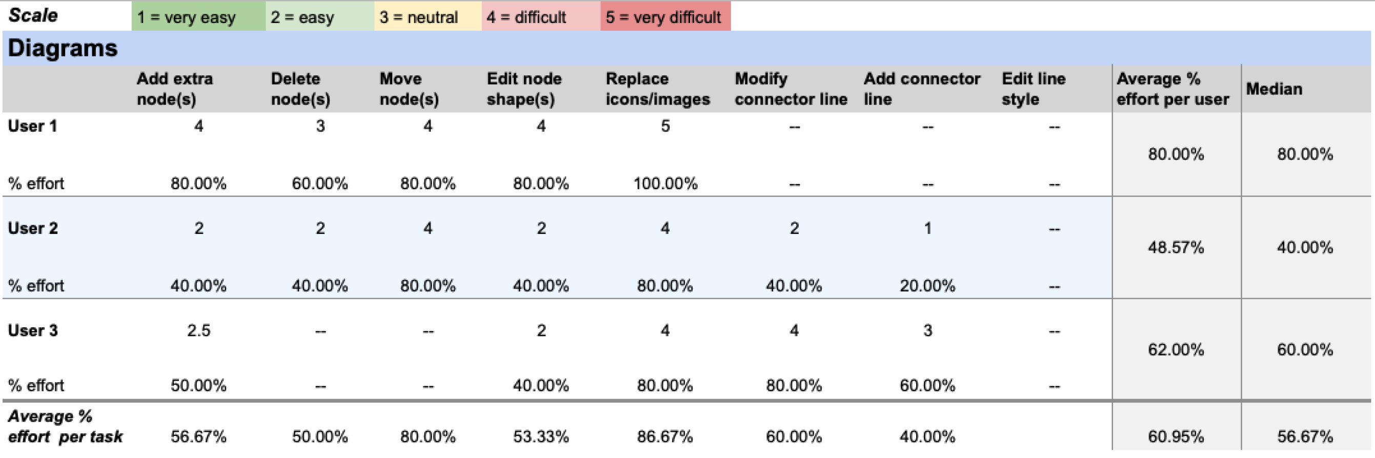
Summary of required effort of mind map tasks. Lower is better.

What makes a radial mind map radial?

With both qualitative and quantitative data further validating the need for an easier way to build a radial mind map, I decided to define what a radial mind map actually is. What differentiates it from a regular mind map? What are its characteristics? Its attributes?
An image of a radial mind map annotated to highlight what makes it different than a regular mind map
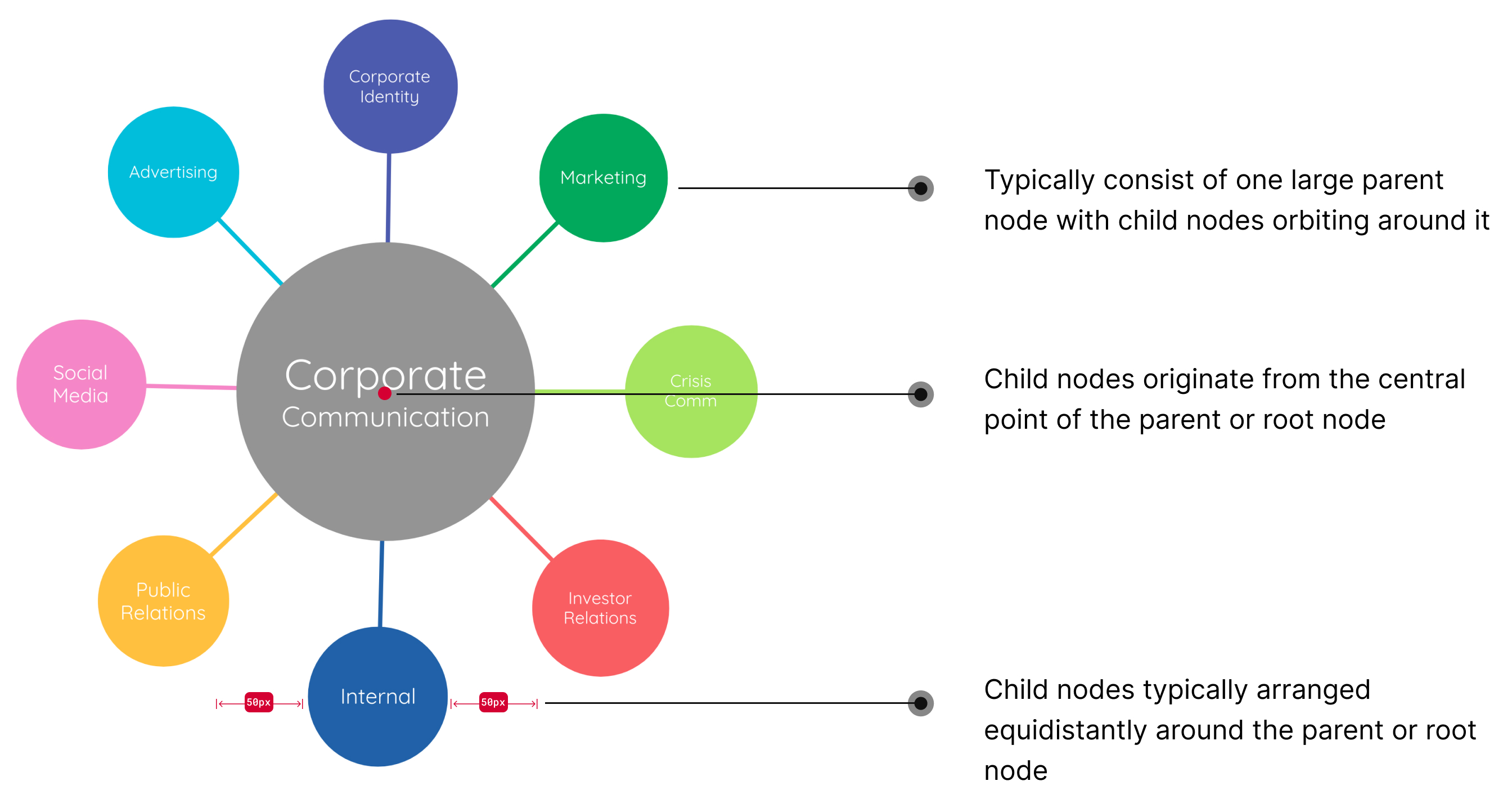
Attributes of a radial mind map

How does our existing widget fall short?

The existing mind map widget just didn’t lend itself to creating a radial look. It was designed with a horizontal or vertical shape in mind. Children nodes originated from the East or West points of the parent node—leading to a strange looking mind map. It was equally as strange when adding nodes to the North or South points.
An attempt at building a radial mind map with our existing mind map widget.

Early exploration

With this particular problem, there was no reference. Competitive analysis didn’t turn up a single product that solved this problem. I had to start from scratch.
Without knowing where to start, I drew inspiration from a set of algorithms that the devs on my team had mentioned: the force-directed graph and hierarchial grouping. Both were so-called “constraint-based layout algorithms” which seemed to point in a similar direction to where we’d like to go.
My initial approach here was to start with the common actions that a user would take:
Adding a node
Modifying a node
Deleting a node
Early explorations inspired force-directed graphs and hierarchical grouping algorithms

A wild-goose chase

In a 1-1 jam with a fellow designer, we quickly realized that this wasn’t sensible way to approach this problem. There are so many permutations of what a user might do and neither algorithm seemed to get us to where a radial mind map ought to look. There had to be another way to approach this problem.

Understanding the tradeoffs and building a framework

Despite sending me down a rabbit hole, I was able to discern the tradeoffs up for consideration. I created a framework that I then presented to the design team.
Coupled with the definition of the radial mind map and how users are behaving, we decided that the “Structured/Global quadrant” was the best approach.
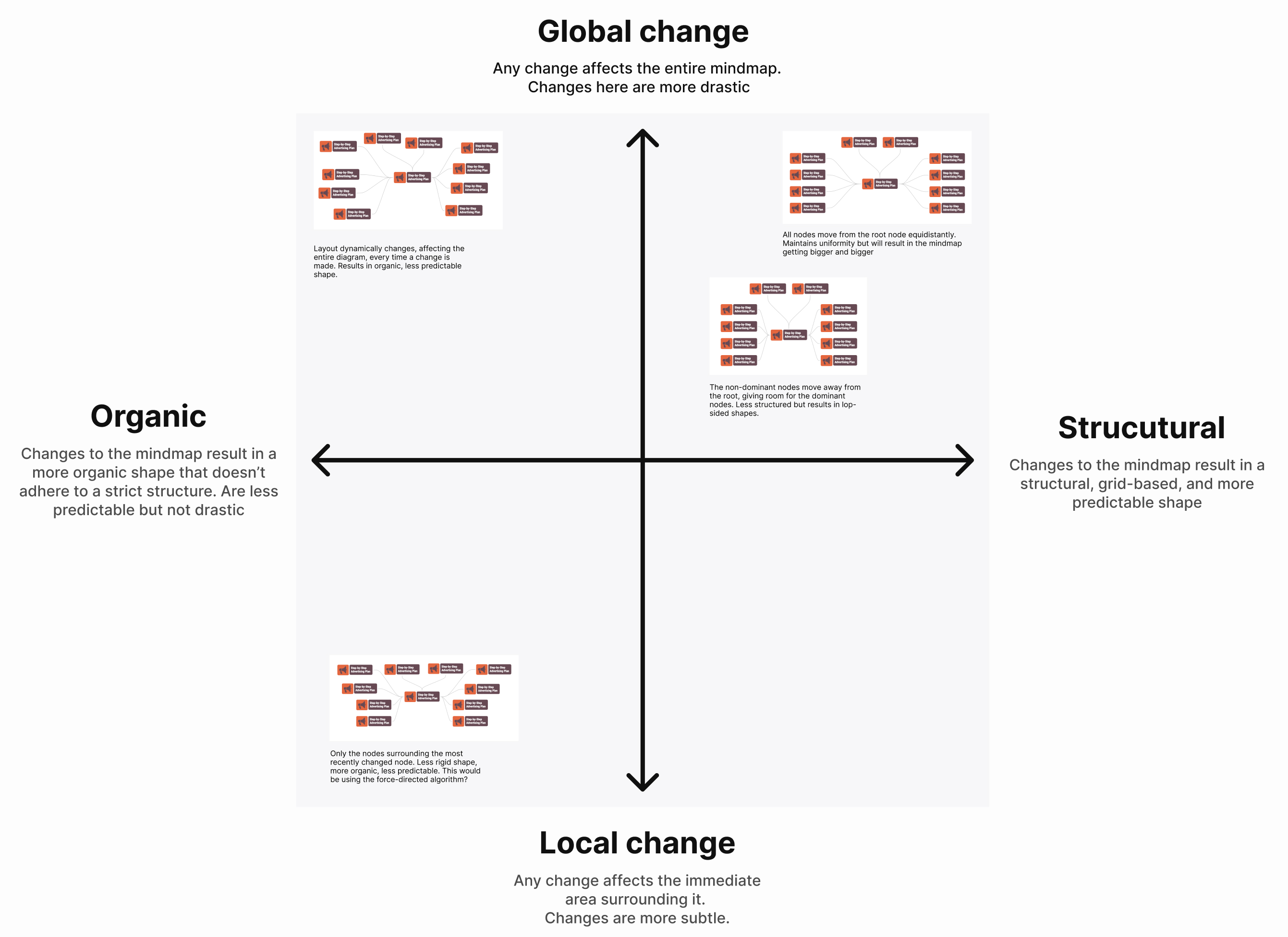
A framework to help frame the tradeoffs considered for solving the radial mind map problem.

Drawing inspiration from the real world

The Structured/Global quadrant ruled out the layout algorithms. So I turned to the world around me for inspiration. I noticed that when people arrange themselves in a circle they form a “track” that everyone sticks to. When someone new joins them they line themselves up on that track—maintaining the circle shape.
When someone new joins them they line themselves up on that track—maintaining the circle shape.
Photo of people arranged in a circle. Original photo taken by Marco Savastano.

The Radial Track

With this insight in mind, I began to explore how this might work grounded in user behaviour and the layout framework I developed.
Exploring how a track around the root node gets set. The track ensures that all child nodes are arranged radially around the root node.
Illustrating the  two states of the track: available space and “maxxed”.
Exploring options for how to handle the state where the track gets “maxxed”

Putting it all together

Once I collected feedback from the design team, I created a prototype highlighting the following interactions:
Adding a child node
Maxxed track state
How a user might break away from the radial layout
How a user might reset  the mind map
Controlling the distance between the child nodes and root node

Bringing it to life

Once I finished shaping the project, I pitched it and then shortly after we began building. We decided to test with users during building. I couldn’t prototype a mind map that was of a high-fidelity required to get meaningful feedback.

Adding a child node

I explored several options of how a user might add a child node: from the North, East, West, and South (NESW) points, anywhere around the root node, or on points on the track. Through several rounds of internal feedback, I decided to let users add a child node from anywhere around the node.
User testing however, quickly proved that this was distracting. One user described it as “unsettling”. We quickly iterated and changed it the expected NESW points.
User testing however, quickly proved that this was distracting. One user described it as “unsettling”.

Tidy

The tidy button gives users a super quick way to get back to a radial shape. It gives users the piece of mind to add, modify, or delete nodes.
With a click the mind map will arrange every child node equidistantly from the root—taking into consideration the number of nodes and size of each node.

Resizing the track

Right after a design critique, a designer and I were talking about the track. She raised a scenario I hadn’t considered: “What if I wanted to change the distance between all the child nodes and the root node? Is there a better way than multi-selecting?”
What if I wanted to change the distance between all the child nodes and the root node? Is there a better way than multi-selecting?
I had an idea: What if we revelealed the track and let users resize it to change the distance between the child nodes and root node? We refined the interaction through several rounds of user testing.

Impact

When measuring the impact of a project in the editor, we turn to the what we call “Completion”. This looks at the percentage of designs that get completed. A completed design is when a user downloads or shares a design. A completed design is a good signal that users are happy with what they designed.
We compared the Completion of the radial mind map templates versus the Completion of free-from radial mind maps. So far we’re seeing a 7% increase in Completion.
+7% increase in design completion

Next Steps

Work is ongoing on radial mind maps. One thing in particular, is allowing users to “snap” child nodes to the track. When nodes are being dragged, users can’t see the track. This makes it difficult to tell if they're snapping on or off the track or how far from the track they're dragging the node. We also noticed that users attempt to drag nodes back to a track. “Snapping” will hopefully make this possible with little effort.
We've also begun a round of user interviews to remeasure the effort required for common mind map building tasks. We hope to see a decrease in effort across the board and gain insights to drive next steps.

Lessons learned

This was a challenging project. One that I wasn't prepared for and didn't imagine to be working on as a Product Designer. I learned a few things along the way:
We all know the familiar feeling of falling down a rabbit hole. You're putting in the work but getting further and further away from where you need to be. The best medicine is to resist the urge to keep going and setup a small 1-1 design jam. In fact, it might be an even better idea to do it ahead of time, to time box the rabbit hole. This was an invaluable tactic for this project and one I plan to continue doing.
An appreciation for what I'm calling the "silent interactions"—selection, deselection, click-drag versus click and then drag. The small details that are invisible when they work but incredibly frustrating when they don't.
Turning to the world around me for inspiration. There's lots to learn from in the physical world.

More work

Screenshots of 3 screens from a pharmacy app called Nimble. Set on a muted green background. Illustration of website wireframe and a bar graph set on a muted blue background.